
As part of their new mission to “engage and develop the next generation of innovators and creative thinkers,” the Creative Education Foundation (CEF) held a two day event to bring together innovators and educators. The ultimate goals of the event were to help teachers be more creative as well as provide them with strategies to help cultivate creative thinking skills in their students.
This project was a collaboration with Scotty Green.
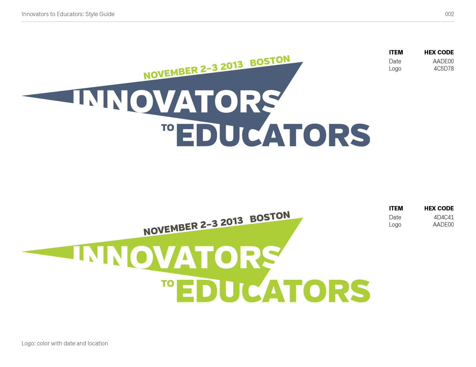
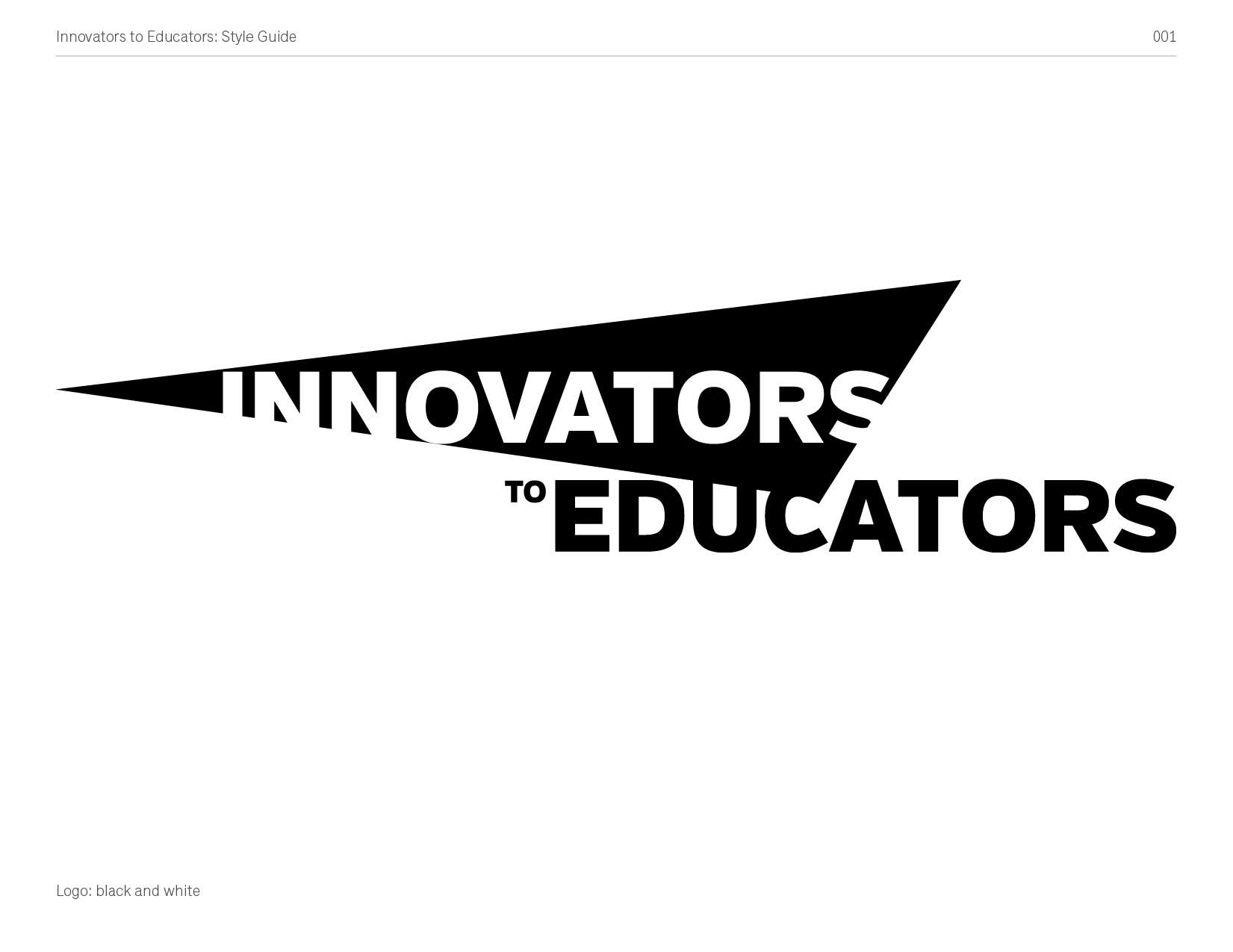
LOGO
In the development of the logo, the goal was to convey the confluence of innovation education formally, while also creating a dynamic, recognizable contour.
DIGITAL FLYER
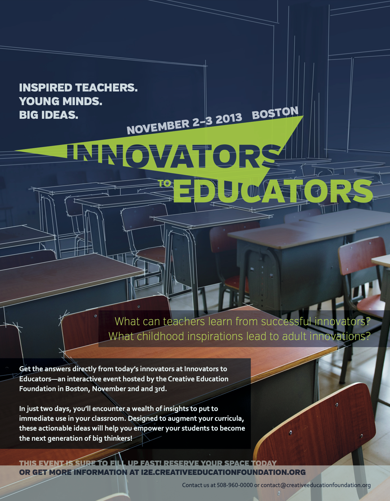
Innovators to Educators flyer. A classroom filled with desks. A dark blue gradient, heavy at the top, lighter to the bottom. White lines overlay the desks in the distance, becoming less present to the foreground. These imply a blueprint.
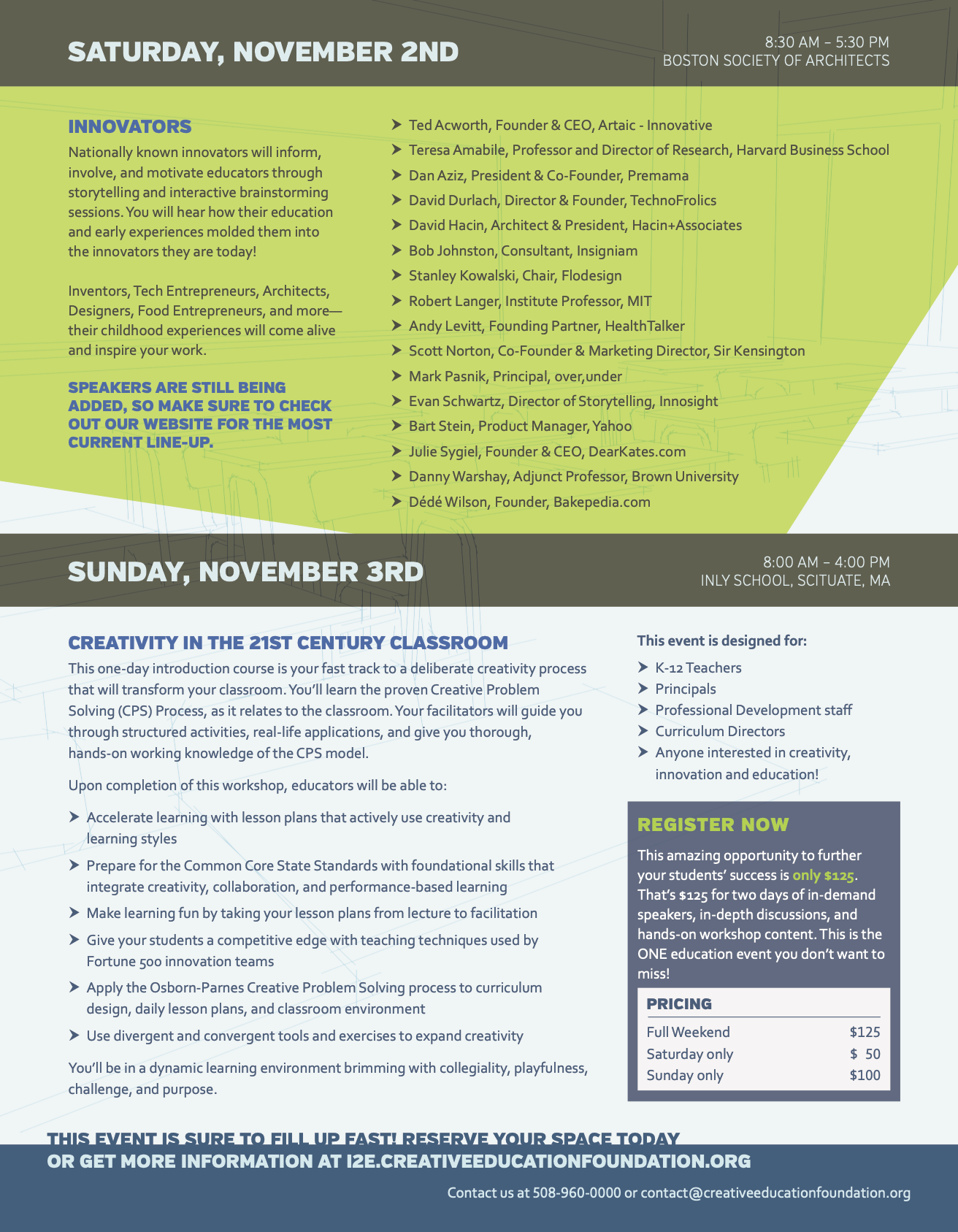
PRINT MAILER
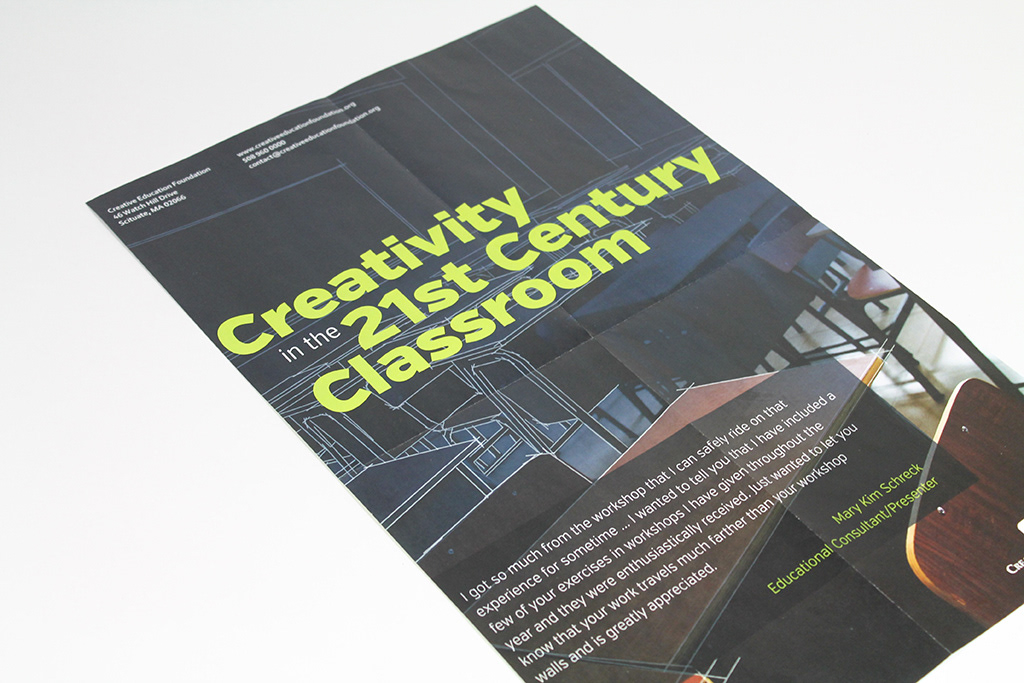
Designed as a french fold pamphlet.
front
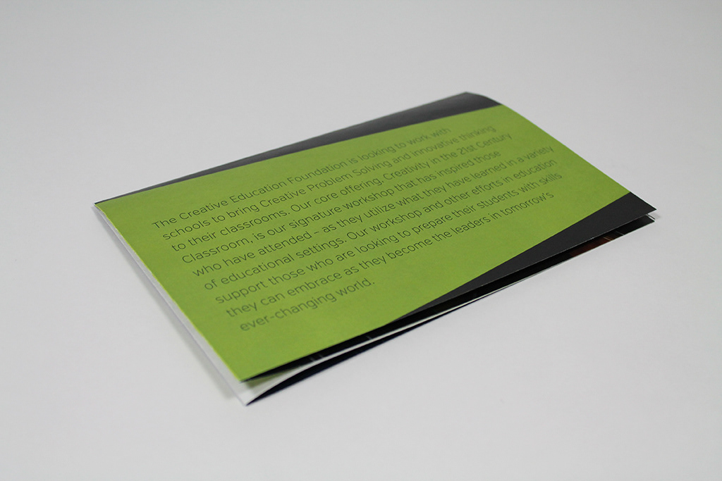
back
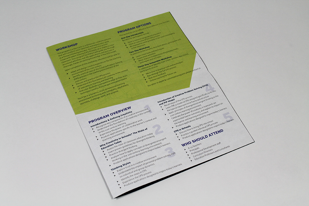
inside fold 1
inside fold 2
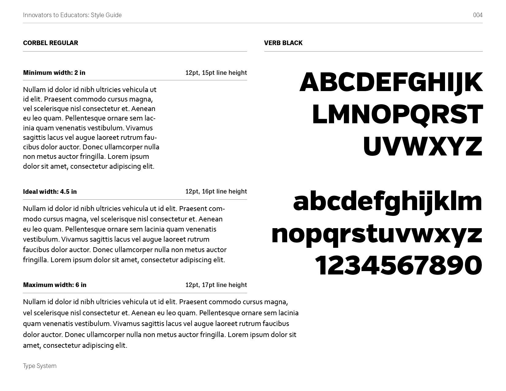
STYLE GUIDE
The organization wanted an identity system that they would be able to implement in-house to create materials like name tags, folder labels, presentations, and the event website. We provided them with a style guide to help them maintain consistency across all of these applications.